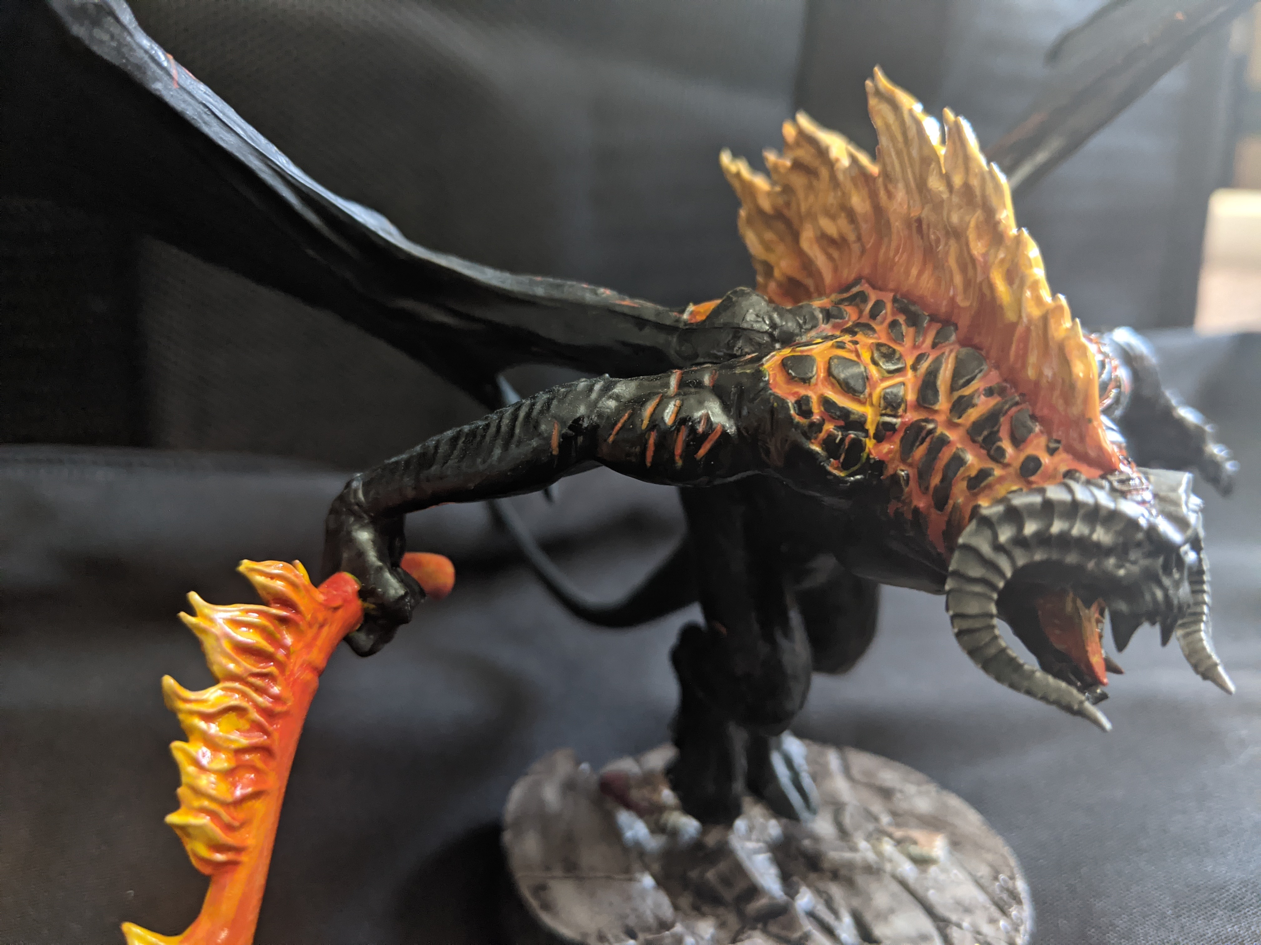
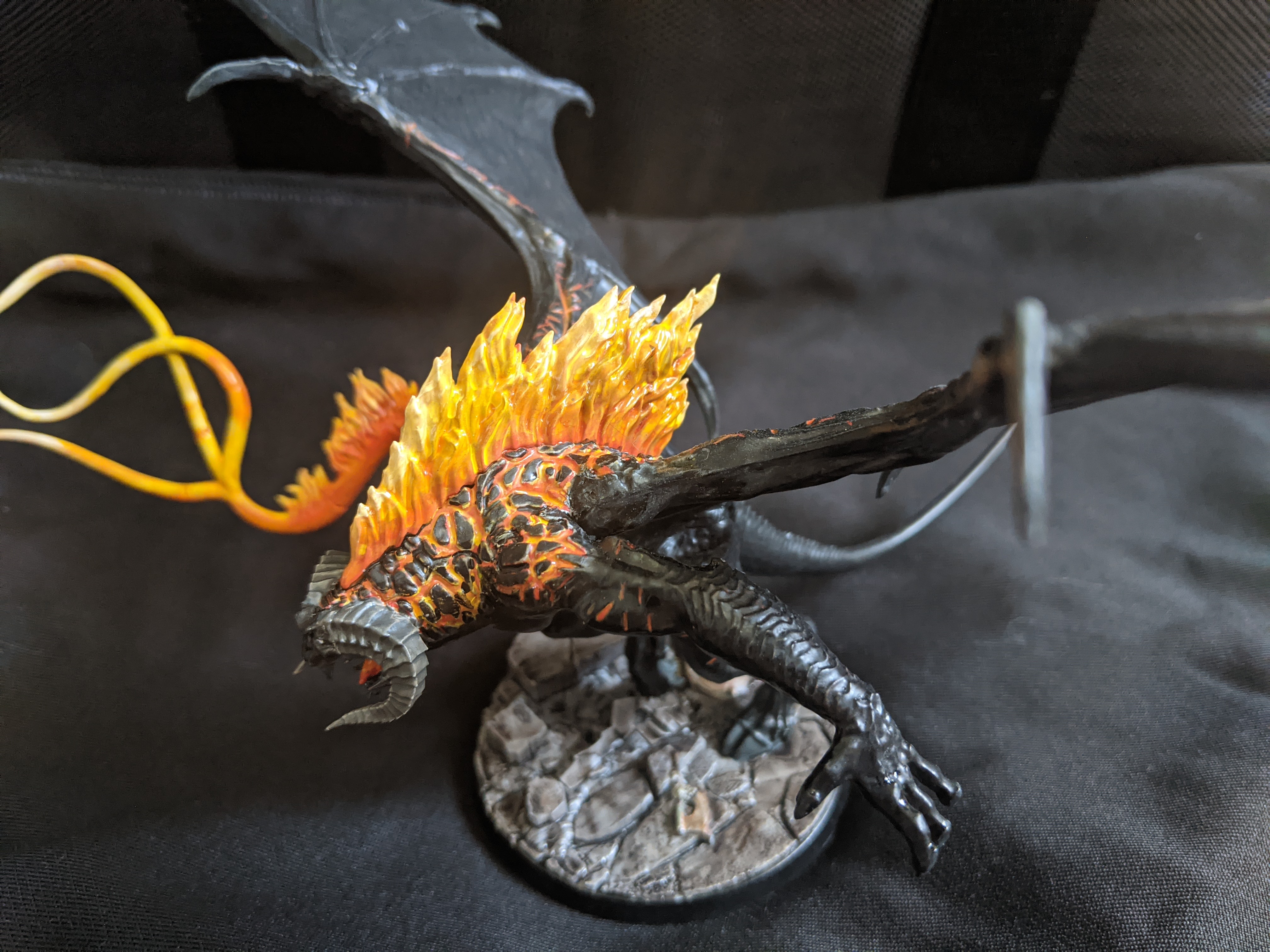
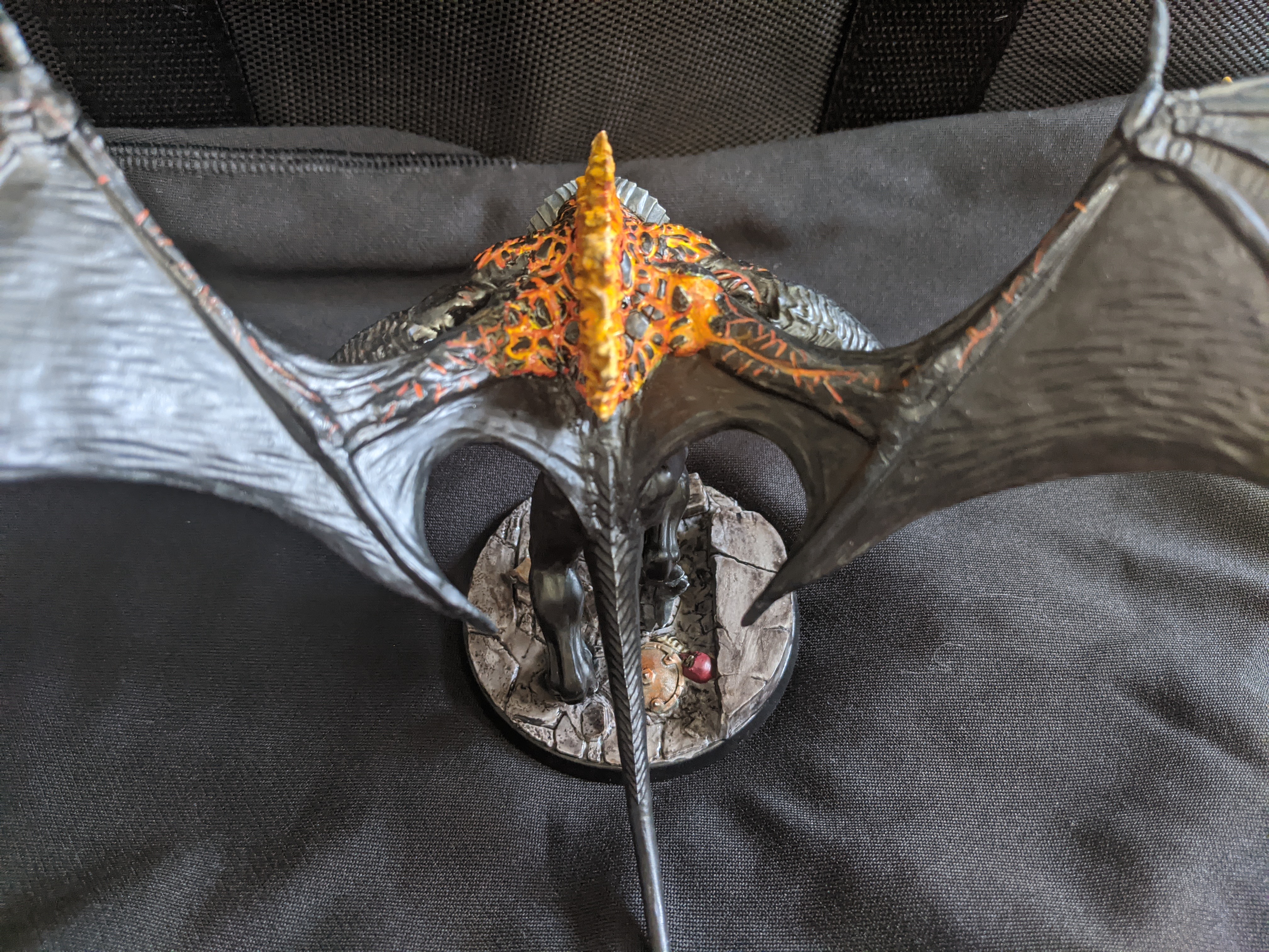
Recently (over the past almost two years) I’ve been getting into painting miniatures. The miniatures are almost always game pieces – be it figures from the Fallout board game, ships in Star Wars: Armada, or World War II Bolt Action platoons. I’ll probably be writing more about my learning curve so not everybody has to make the same mistakes and silly purchases that I did, but for now, I want to talk about something that people take for granted: black.
Yep, black – you know, the shade that we see everywhere. My phone is back, my shirt is black, my notebook, some of the two cats I have, black is a color that fits on any model or painting. It can help add texture and depth, give a cool look on a starship, or just make a nice black belt for a soldier to really bring the outfit together. However, those things aren’t ACTUALLY black – they’re very dark shades of grey. There’s a distinction to make here, and that is that black is the absence of light. It’s a void. It’s something that is incredibly difficult to replicate, especially in paint or media… And that may be why when I came across an article on Vantablack, I was intrigued. Vantablack is the darkest material people can create (as of writing it may have been recently dethroned, I don’t know). Using Vantablack creates a void-like appearance because barely any light is reflected back to the viewer – it truly is the absence of light.
The problem with Vantablack is twofold – first, it’s something that pretty much needs to be applied in a specialized lab, and second, the exclusive use of it for artistic purposes is owned by some dude, who is pretty smug about it. Like the rest of miniature painters everywhere, I just used my regular blacks and got along just fine, until I came across an ad promoting a paint that was the darkest on the market. That’s where I first saw Culture Hustle’s Black 2.0 (I’m not an affiliate, I’m not getting paid, or getting free stuff, or anything like that). I had a few projects in mind for scenery and miniatures where a true void effect would look pretty neat, so I bought a bottle, waited a bit, and then painted something up.
The results were… Okay. The pictures that are used on the site show Black 2.0 in its absolute best scenarios – to the eye, though, it looked not much different than my regular black. I will say that it was much easier to get a solid black with 2.0, but was it worth it over my Citadel paints? Not so much.
Then, of course, came Black 3.0. It was marketed as being even darker, and if you used 2.0 as a base layer then coated 3.0 on top, you’d have the blackest black that black has ever been! (It sounded fishy, I know). Again, I decided “What the hell?” and bought a bottle. This time, we’re on to something.
Black 3.0 truly is the blackest paint I own (still not getting paid). One of the models I wanted to paint was a TIE Phantom from X-Wing, the miniature game from Fantasy Flight. TIE Phantoms are supposed to be able to cloak themselves to be invisible to the naked eye, and since they’d be deployed in space… Well, a black void paint just fits. Here is the current Work-in-Progress model, where I have only painted black.
The effect is the ship going into the void (cloaking). This model is the factory paint, then the black is a base coat of Black 2.0 and a single layer of Black 3.0. The eye is better than a camera, so while it’s not a complete void, it’s an effect that’s hard to describe – if it were over a black background, it would blend seamlessly. Only by holding a bright light next to it can you start to see the texturing on the wings, and under no play circumstance would that happen.
So, being happy with my choice so far, I was curious about how this new Black 2.0+3.0 combination stacked up to the other blacks in my box(es) of paint. For that, I made a little sample swatch for everyone!
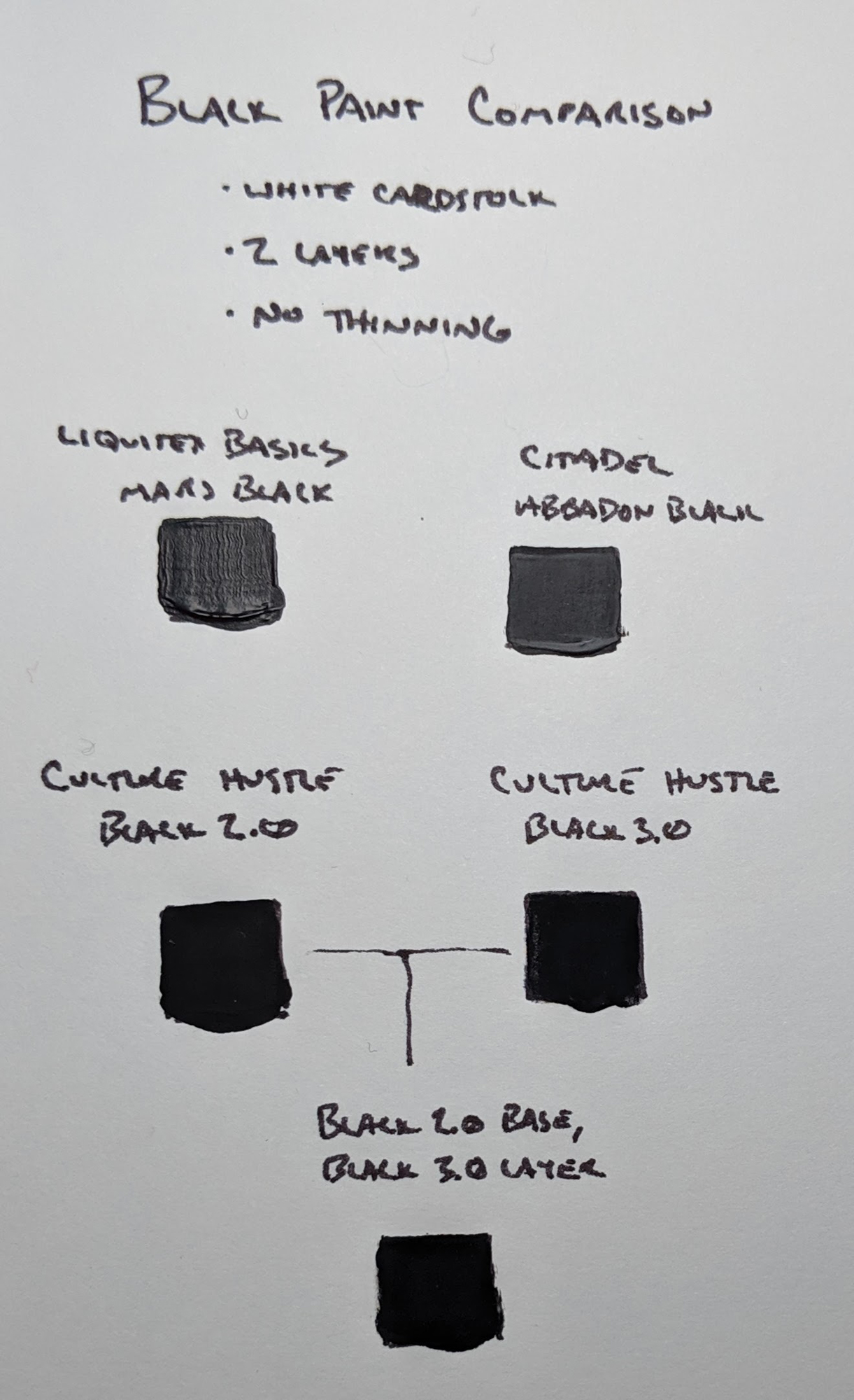
In the swatch, you can see:
- Liquitex Basics Mars Black
- Citadel Abbadon Black base
- Black 2.0
- Black 3.0
- Black 2.0 for the first coat, 3.0 for the second
None of the paints have been thinned, and they had dried for about 10 minutes when the picture was taken. It was on white cardstock, and it was lit by a very bright daylight-balanced source about a foot away.
Again, this is something that is hard to capture with a camera, but here are some observations:
- On its own, the cheap Liquitex Basics Mars Black would have been pretty darn black. There is a bit of shine and gloss to it, though, so keep that in mind.
- Citadel’s Abbadon Black is going to be great for most uses. Really, this is the realistic black that you see day-to-day, like a non-gloss phone case or a black outfit.
- Black 2.0 was very matte. Of course, it was darker than Liquitex and Citadel, and I’d have thought it would be as black as black can be.
- Black 3.0 on its own shows very little difference between 2.0. It seemed like maybe it was darker, but if I had to pick it out from its predecessor I would probably fail.
- Black 2.0 undercoat with 3.0 topcoat truly is like a void. It’s bizarre. You hold it up to a lamp, three inches away, and it’s STILL BLACK. It’s like a borderline optical illusion.
I wanted to see what I could do here, so I loaded up Photoshop and added some exposure filters to the chart. See the results below (and click on it for a larger version).
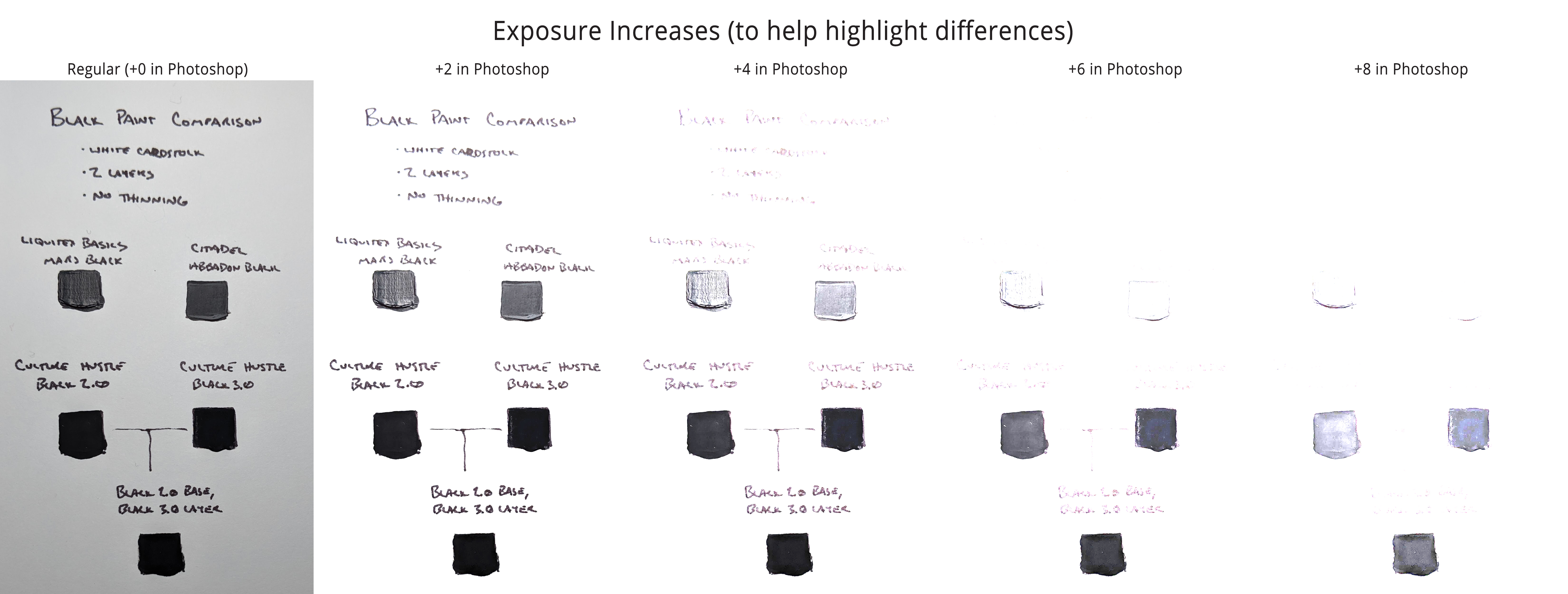
With exposure pretty much blown out, now we can definitely see some differences.
tl;dr – How do I get the blackest black acrylic paint?
In my testing, you would want to use the Culture Hustle Black 2.0 as your base coat (after primer), let it dry for a good day, then put 3.0 overtop. You’ll get an extremely unique effect that will draw attention and trick the eye. I would not suggest this replace your usual black since it looks almost unnaturally dark, but it sure is something to see.
Hopefully, this helps fellow miniature painters in their shopping – what we have is a truly dark acrylic, so while the marketing is strong with 2.0/3.0, there is actually some value to it.
Paints used: